Matplotlibは強力なグラフ作成ライブラリですが、複数のグラフを組み合わせる場合、コードが冗長になりがちです。また、簡単なグラフを描く場合でも、グラフごとにメソッドとパラメータが異なるため、それらを把握しておく必要があります。
今回紹介する MultiChartクラスは、Matplotlibの機能を基に、より直感的なインターフェースを提供することで、グラフ作成時の負担を軽減することを目的としています。
Matplotlibの基本的な使い方については、「Matplotlibによるグラフ作成のポイントをサンプル付きで紹介」に詳細を記載していますので、併せてご覧ください。
MultiChartクラスの概要
- 多様なグラフ
複数のグラフを一つの図にまとめたい場合、従来は各グラフを個別に作成し、レイアウト調整が必要でした。MultiChartクラスでは、一つのインスタンスで複数のグラフを管理できるため、大幅なコード量の削減と作業効率の向上が期待できます。 - カスタマイズ性
グラフのタイトル、軸ラベル、色、線種、マーカーなど、細かな部分まで指定できるようにしました。また、不足している機能を後から追加しやすいように、レイアウト部分と描画部分を分けたり、できるだけ多くのコメントを記述するようにしました。
インストールとImport
install が必要なモジュールは matplotlib のみです。
pip install matplotlib
MultiChart でグラフを描画する場合は、次の5つのモジュールのインポートが必要です。
import matplotlib.pyplot as plt
from matplotlib import rcParams
import matplotlib.dates as mdates
import numpy as np
import datetime
使い方
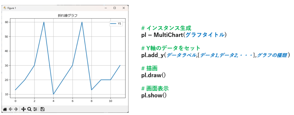
MultiChart クラスのインスタンスを生成し、add_y()に表示したいデータを指定、draw() メソッドでグラフを描画し、show() メソッドで画面に表示します。
例えば上記のグラフは、次の4行で描くことができます。
pl = MultiChart('折れ線グラフ')
pl.add_y('Y1',[13,20,30,60,10,20,30,60,13,20,20,30],'line')
pl.draw()
pl.show()
add_y() メソッドには、最低限の引数として「データラベル」、「データ」、「グラフの種類」を指定します。これ以外にも線の色や太さ、透明度など多くの引数が指定できますが、それは後ほど説明致します。
add_y(ラベル,[データ1,データ2,データ3,・・・],グラフの種類)
上記サンプルでは省略しましたが、X軸を指定することも可能です。
X軸は add_x() 又は add_label() で指定します。
X軸を省略した場合、自動的に0,1,2,3,・・・の連番が生成されます。
add_x( [ データ1,データ2,データ3,・・・ ] )
add_labels( [ ラベル1,ラベル2,ラベル3,・・・] )
グラフの種類は次の値が指定可能です。
| 'line' | 折れ線グラフ |
|---|---|
| 'bar' | 縦棒グラフ |
| 'stacked' | 積み上げ縦棒グラフ |
| 'barh' | 横棒グラフ |
| 'stackedh' | 積み上げ横棒グラフ |
| 'scatter' | 散布図 |
| 'box' | 箱ひげ図 |
| 'hist' | ヒストグラム |
| 'pie' | 円グラフ |
| 'rader' | レーダーチャート |
複合グラフ(重ね合わせ)
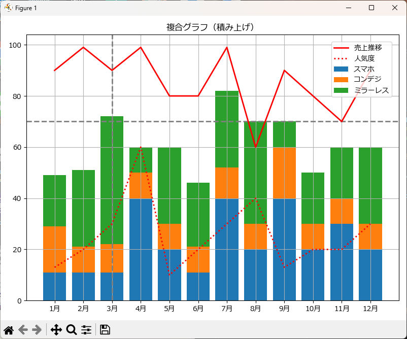
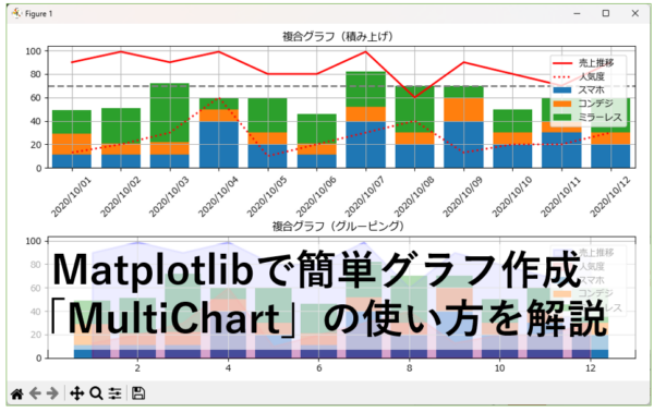
pl.chart_title("複合グラフ(積み上げ)")
pl.hline(70,color='gray',linestyle='--')
pl.vline(2,color='gray',linestyle='--')
pl.add_label([f"{x+1}月" for x in range(12)])
pl.add_y('売上推移',[90,99,90,99,80,80,99,60,90,80,70,90],'line',axis='right',color="red")
pl.add_y('人気度',[13,20,30,60,10,20,30,40,13,20,20,30],'line',axis='right',color='red',linestyle=':')
pl.add_y('スマホ',[11,11,11,40,20,11,40,20,40,20,30,20],'stacked')
pl.add_y('コンデジ',[18,10,11,10,10,10,12,10,20,10,10,10],'stacked')
pl.add_y('ミラーレス',[20,30,50,10,30,25,30,40,10,20,20,30],'stacked')
pl.draw()
pl.show()
上記のプログラムは、水平線、垂直線、折れ線グラフ、積み上げ棒グラフの複合グラフの例です。add_y() にデータとグラフの種類を指定していくことで、複合グラフが簡単に描画できます。
X軸の日付/時刻表示
X軸に日付や時刻を指定する場合は、add_x() に datetime又は date 型のデータをセットし、pl.axis_formatter() で表示したい書式を指定します。
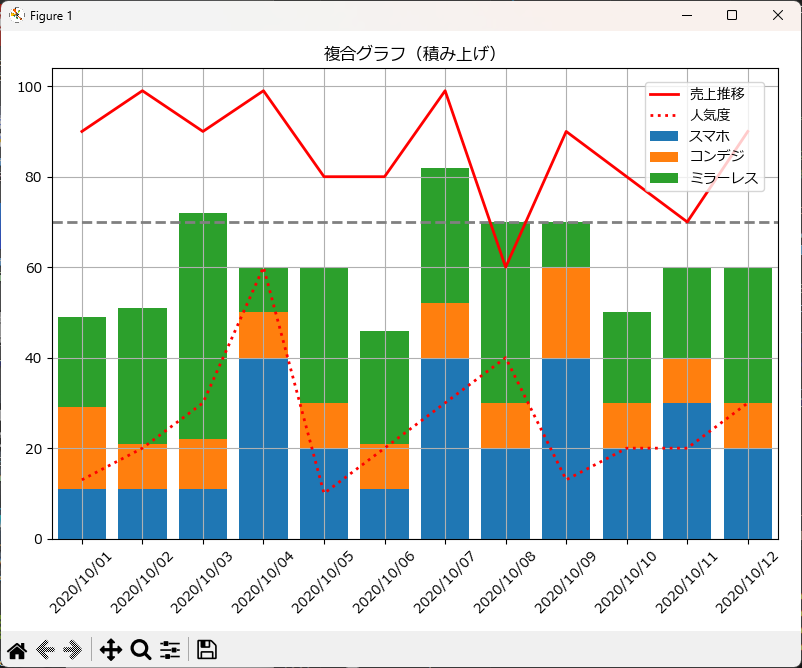
pl = MultiChart(title='複合グラフ(積み上げ)',width=8,height=6,islegend=True)
pl.hline(70,color='gray',linestyle='--')
pl.vline(2,color='gray',linestyle='--')
pl.add_x([datetime.datetime(2020,10,1) + datetime.timedelta(days=i) for i in range(12)])
pl.axis_formatter(step=1,rotation=45,formatter='%Y/%m/%d')
pl.add_y('売上推移',[90,99,90,99,80,80,99,60,90,80,70,90],'line',axis='right',color="red")
pl.add_y('人気度',[13,20,30,60,10,20,30,40,13,20,20,30],'line',axis='right',color='red',linestyle=':')
pl.add_y('スマホ',[11,11,11,40,20,11,40,20,40,20,30,20],'stacked')
pl.add_y('コンデジ',[18,10,11,10,10,10,12,10,20,10,10,10],'stacked')
pl.add_y('ミラーレス',[20,30,50,10,30,25,30,40,10,20,20,30],'stacked')
pl.draw()
pl.show()
add_y() メソッドに datetime.datetime 又は datetime.date 型のリストを渡し、axis_formatter でX軸ラベルの傾きとフォーマットを指定することで、X軸に日付や時刻が表示できます。
subplotによる複数グラフ
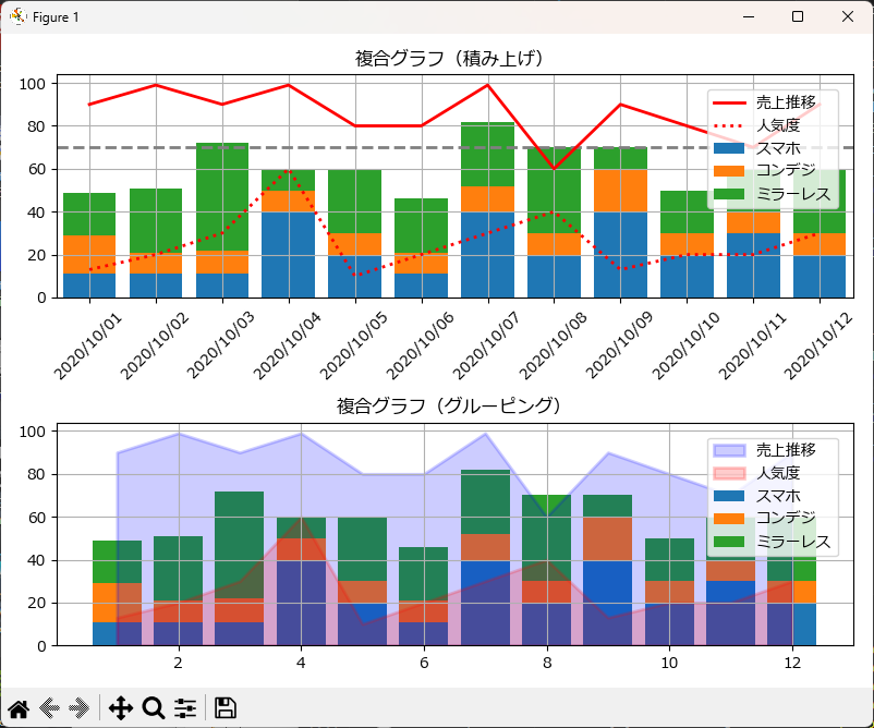
pl = MultiChart(width=8,height=6,islegend=True)
pl.chart_title("複合グラフ(積み上げ)")
pl.hline(70,color='gray',linestyle='--')
pl.vline(2,color='gray',linestyle='--')
pl.add_x([datetime.datetime(2020,10,1) + datetime.timedelta(days=i) for i in range(12)])
pl.axis_formatter(step=1,rotation=45,formatter='%Y/%m/%d')
pl.add_y('売上推移',[90,99,90,99,80,80,99,60,90,80,70,90],'line',axis='right',color="red")
pl.add_y('人気度',[13,20,30,60,10,20,30,40,13,20,20,30],'line',axis='right',color='red',linestyle=':')
pl.add_y('スマホ',[11,11,11,40,20,11,40,20,40,20,30,20],'stacked')
pl.add_y('コンデジ',[18,10,11,10,10,10,12,10,20,10,10,10],'stacked')
pl.add_y('ミラーレス',[20,30,50,10,30,25,30,40,10,20,20,30],'stacked')
pl.draw(2,1,1)

pl.clear()
pl.chart_title("複合グラフ(グルーピング)")
pl.add_x([1,2,3,4,5,6,7,8,9,10,11,12])
pl.add_y('スマホ',[11,11,11,40,20,11,40,20,40,20,30,20],'stacked',axis="right")
pl.add_y('コンデジ',[18,10,11,10,10,10,12,10,20,10,10,10],'stacked',axis="right")
pl.add_y('ミラーレス',[20,30,50,10,30,25,30,40,10,20,20,30],'stacked')
pl.add_y('売上推移',[90,99,90,99,80,80,99,60,90,80,70,90],'line',axis='right',color="blue",fill=True,alpha=0.2)
pl.add_y('人気度',[13,20,30,60,10,20,30,40,13,20,20,30],'line',axis='right',color='red',linestyle=':',fill=True,alpha=0.2)
pl.draw(2,1,2)

pl.show()
draw() の内部では add_subplot() が呼び出されているのですが、この add_subplot() に対して、draw() 経由で行数、列数、表示位置を渡すことができます。これを利用すると、1つの Figure に対して複数のグラフを描画できます。
この時のポイントは、chart_title() と clear() メソッドです。
chart_title() でグラフごとのタイトルを設定し、draw() でグラフを描画した後で clear() で、それまでの描画情報(X軸、Y軸に指定した値など)をクリアします。
clear()
chart_title(グラフタイトル)
add_x(~)
add_y(~)
draw(~)
既存 figure へのグラフ描画
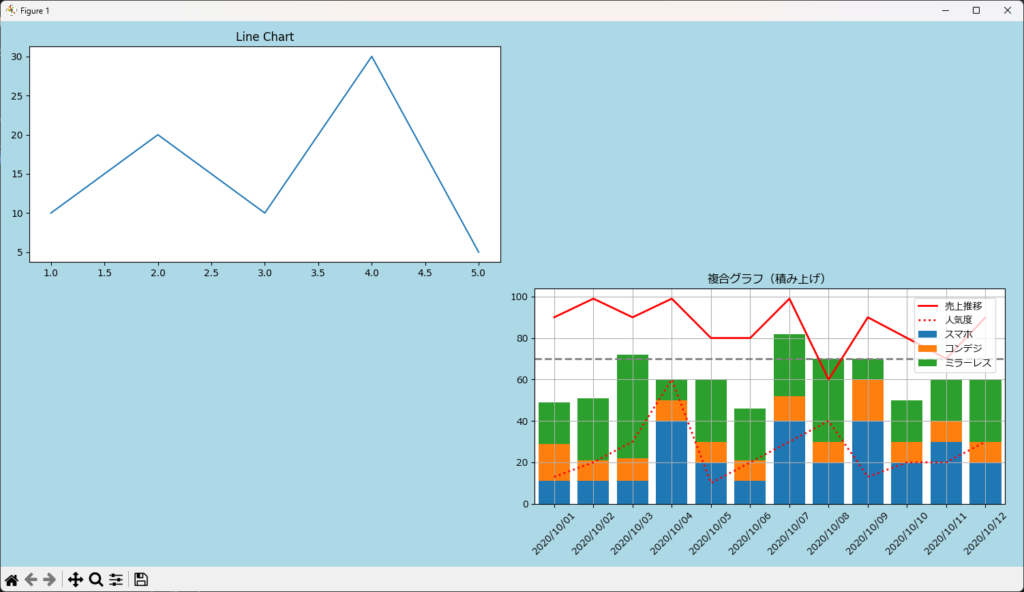
# 事前にfig を作成
fig = plt.figure(figsize=(15,8))
fig.set_facecolor("lightblue")
ax = fig.add_subplot(2,2,1)
ax.set_title("Line Chart")
ax.plot([1,2,3,4,5],[10,20,10,30,5])

# fig を引き継いでグラフを描画
pl = MultiChart(fig=fig)
pl.chart_title("複合グラフ(積み上げ)")
pl.hline(70,color='gray',linestyle='--')
pl.vline(2,color='gray',linestyle='--')
pl.add_x([datetime.datetime(2020,10,1) + datetime.timedelta(days=i) for i in range(12)])
pl.axis_formatter(step=1,rotation=45,formatter='%Y/%m/%d')
pl.add_y('売上推移',[90,99,90,99,80,80,99,60,90,80,70,90],'line',axis='right',color="red")
pl.add_y('人気度',[13,20,30,60,10,20,30,40,13,20,20,30],'line',axis='right',color='red',linestyle=':')
pl.add_y('スマホ',[11,11,11,40,20,11,40,20,40,20,30,20],'stacked')
pl.add_y('コンデジ',[18,10,11,10,10,10,12,10,20,10,10,10],'stacked')
pl.add_y('ミラーレス',[20,30,50,10,30,25,30,40,10,20,20,30],'stacked')
pl.draw(2,2,4)
pl.show()
既に用意されている fig を引き継ぎ、MultiChart を用いて任意の位置にグラフを挿入できます。既に何らかのグラフが描画されており、その一部に複合グラフを追加したい場合に便利です。
グラフのファイル出力
draw() の後に save() を使うと、グラフをファイルに出力できます。
draw(ファイル名)
pl = MultiChart(width=10,height=10,fontsize=12,backcolor="beige")
pl.chart_title("カメラ")
pl.add_y('スマホ',[11,11,11,40,20,11,40,20,40,20,30,20],'stacked')
pl.add_y('コンデジ',[18,10,11,10,10,10,12,10,20,10,10,10],'stacked')
pl.add_y('ミラーレス',[20,30,50,10,30,25,30,40,10,20,20,30],'stacked')
pl.draw()
pl.save("p:/data.png")
リファレンス
MultiChartクラスのプロパティ
MultiChartクラスには次のプロパティが実装されています。
| プロパティ名 | データ型 | 意味 | 初期値 |
|---|---|---|---|
| label | str | ラベル | なし |
| values | [int] または [float] | Y軸にプロットする値のリスト | なし |
| charttype | str | チャートタイプ (plot, bar, line, scatter, box, barh, stacked, stackedh, hist, pie, radar) | 'plot' |
| linewidth | int | 折れ線の太さ | 2 |
| linestyle | str | 折れ線の種類 ('-', '--' など) | None |
| color | str | 折れ線の色 | None |
| marker | str | マーカーの形状 | 'o' |
| markersize | int | マーカーサイズ | 0 |
| markerfacecolor | str | マーカーの色 ('red', 'b' など) | None |
| axis | str | Y軸の指定 ('left' または 'right') | 'left' |
| alpha | float | 透明度 | 1 |
| fill | bool | 折れ線の塗りつぶし | FALSE |
| bins | int | ヒストグラムの階級数 | 10 |
| title | str | タイトル | '' |
| width | int | ウィンド横サイズ(インチ単位) | None |
| height | int | ウィンド縦サイズ(インチ単位) | None |
| facecolor | str | ウインドウの背景色 | None |
| backcolor | str | グラフ背景色 | None |
| linewidth | int | グラフ外形枠の太さ | 3 |
| edgecolor | str | グラフ外形枠の色 | None |
| islegend | bool | 凡例の表示/非表示設定 | TRUE |
| position | str | 凡例の位置 ('upper right' など) | 'upper right' |
| font | str | フォント ('Meiryo' など) | 'Meiryo' |
| fontsize | int | フォントサイズ | 10 |
| margine_left | float | 左マージン | None |
| margine_right | float | 右マージン | None |
| margine_top | float | 上マージン | None |
| margine_bottom | float | 下マージン | None |
| wspace | float | 横方向のマージン | None |
| hspace | float | 縦方向のマージン | None |
| x_labels | list | X軸に表示するラベルのリスト | [] |
| x_plots | list | X軸にプロットする値のリスト | [] |
| y_plots | list | Y軸にプロットする値のリスト | [] |
| x_title | str | X軸のタイトル | '' |
| axis_y1_title | str | 左側Y軸のタイトル | '' |
| axis_y2_title | str | 右側Y軸のタイトル | '' |
| scatter_default_size | int | 散布図のデフォルトマーカーサイズ | 8 |
| formatter | dict | X軸のフォーマット (rotation, step, formatter) | {'rotation': 0, 'step': 1, 'formatter': ''} |
| fig | matplotlib.figure.Figure | MatplotlibのFigureオブジェクト | None |
| axis_y1 | matplotlib.axes.Axes | 左側Y軸のAxesオブジェクト | None |
| axis_y2 | matplotlib.axes.Axes | 右側Y軸のAxesオブジェクト | None |
| v_lines | list | 垂直線の設定 ({'x': x, 'width': width, 'linestyle': linestyle, 'color': color}) | [] |
| h_lines | list | 水平線の設定 ({'y': y, 'width': width, 'linestyle': linestyle, 'color': color}) | [] |
| groupwidth | float | グループ幅 | 1 |
| barwidth | float | バー幅 | 0.9 |
メソッド
| メソッド名 | 説明 | 引数 |
|---|---|---|
| __init__( label,values, charttype='plot', linewidth=2, linestyle=None, color=None, markersize=0, marker='o', markerfacecolor=None, axis='left', alpha=1.0, fill=False, bins=10 ): | クラスのコンストラクタ。基本的な設定を行う。 | 詳細は上記プロパティ一覧参照 |
| clear() | グラフのクリア。 | なし |
| chart_title(title) | グラフのタイトルを設定。 | title: グラフのタイトル |
| axis_title( x_title, y1_title, y2_title='' ) | X軸とY軸のタイトルを設定。 | x_title: X軸のタイトル, y1_title: 左側Y軸のタイトル, y2_title: 右側Y軸のタイトル |
| set_margine( wspace=None, hspace=None, left=None, right=None, top=None, bottom=None ) | グラフのマージンを設定。 | wspace: 横方向のマージン, hspace: 縦方向のマージン, left: 左マージン, right: 右マージン, top: 上マージン, bottom: 下マージン |
| axis_formatter( step, rotation=0, f ormatter='' ) | X軸のラベルのフォーマットを設定。 | step: ラベルの間隔, rotation: ラベルの角度, formatter: フォーマット |
| add_labels(labels) | X軸のラベルを設定。 | labels: ラベルのリスト |
| add_x(vals) | X軸の値を設定。 | vals: 値のリスト |
| add_y( label, vals, chart_type='plot', linewidth=2, linestyle=None, color=None, markersize=0, marker='o', markerfacecolor=None, axis='left', alpha=1.0, fill=False ) | Y軸の値を設定。 | 詳細は上記プロパティ一覧参照 |
| vline( x, width=2, linestyle='-', color=None ) | 垂直線を描画。 | x: X軸の位置, width: 線の太さ, linestyle: 線の種類, color: 線の色 |
| hline( y, width=2, linestyle='-', color=None ) | 水平線を描画。 | y: Y軸の位置, width: 線の太さ, linestyle: 線の種類, color: 線の色 |
| show() | グラフを表示。 | なし |
| draw( row=1, column=1, position=1, islegend=True ) | row: 行の数 column: 列の数 position: 表示位置 islegend: 凡例の表示 fig: fig の指定 |
add_y() で使えるグラフの種類
| charttype | 指定可能な引数 |
|---|---|
| line | label, values, linewidth, linestyle, color, markersize, marker, markerfacecolor, axis, alpha, fill |
| bar | label, values, color, axis, alpha |
| stacked | label, values, color, axis, alpha |
| scatter | label, values,color, markersize, marker, axis, alpha |
| box | label, values, color, axis, alpha |
| barh | label, values, color, axis, alpha |
| stackedh | label, values, color, axis, alpha |
| hist | label, values, color, alpha, bins |
| pie | label, values, color, alpha |
| radar | label, values, color, alpha |
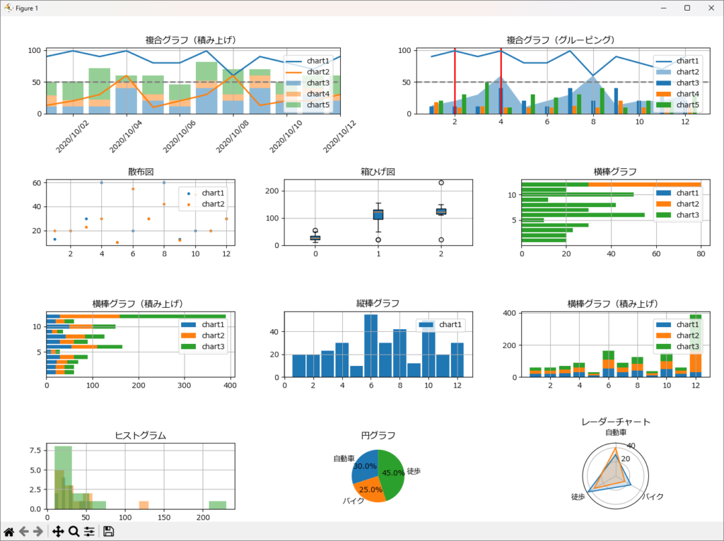
デモのサンプルソース
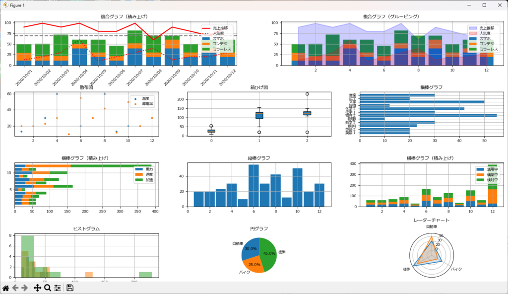
一通りのグラフを表示させるためのサンプルソースです。
pl = MultiChart(width=15,height=8,fontsize=8)
pl.set_margine(hspace=0.6,wspace=0.2)
pl.chart_title("複合グラフ(積み上げ)")
pl.hline(70,color='gray',linestyle='--')
pl.vline(2,color='gray',linestyle='--')
pl.add_x([datetime.datetime(2020,10,1) + datetime.timedelta(days=i) for i in range(12)])
pl.axis_formatter(step=1,rotation=45,formatter='%Y/%m/%d')
pl.add_y('売上推移',[90,99,90,99,80,80,99,60,90,80,70,90],'line',axis='right',color="red")
pl.add_y('人気度',[13,20,30,60,10,20,30,40,13,20,20,30],'line',axis='right',color='red',linestyle=':')
pl.add_y('スマホ',[11,11,11,40,20,11,40,20,40,20,30,20],'stacked')
pl.add_y('コンデジ',[18,10,11,10,10,10,12,10,20,10,10,10],'stacked')
pl.add_y('ミラーレス',[20,30,50,10,30,25,30,40,10,20,20,30],'stacked')
pl.draw(4,2,1)

pl.clear()
pl.chart_title("複合グラフ(グルーピング)")
pl.add_x([1,2,3,4,5,6,7,8,9,10,11,12])
pl.add_y('スマホ',[11,11,11,40,20,11,40,20,40,20,30,20],'stacked',axis="right")
pl.add_y('コンデジ',[18,10,11,10,10,10,12,10,20,10,10,10],'stacked',axis="right")
pl.add_y('ミラーレス',[20,30,50,10,30,25,30,40,10,20,20,30],'stacked')
pl.add_y('売上推移',[90,99,90,99,80,80,99,60,90,80,70,90],'line',axis='right',color="blue",fill=True,alpha=0.2)
pl.add_y('人気度',[13,20,30,60,10,20,30,40,13,20,20,30],'line',axis='right',color='red',linestyle=':',fill=True,alpha=0.2)
pl.draw(4,2,2)

pl.clear()
pl.chart_title("散布図")
pl.add_x([1,2,3,4,5,6,7,8,9,10,11,12])
pl.add_y('温度',[13,20,30,60,10,20,30,60,13,20,20,30],'scatter')
pl.add_y('導電率',[20,20,23,30,10,55,30,42,12,50,20,30],'scatter')
pl.draw(4,3,4)

pl.clear()
pl.chart_title("箱ひげ図")
pl.add_y('数学',[20,20,23,30,10,55,30,42,12,50,20,30],'box')
pl.add_y('英語',[20,20,123,130,110,155,130,142,112,50,120,130],'box')
pl.add_y('物理',[20,120,123,130,110,115,130,142,112,150,120,230],'box')
pl.draw(4,3,5,islegend=False)

pl.clear()
pl.chart_title("横棒グラフ")
pl.add_labels(['英語Ⅰ','英語Ⅱ','数学I','数学Ⅱ','物理I','物理Ⅱ','化学Ⅰ','化学Ⅱ','経済','文学','哲学','音楽'])
pl.add_y('chart1',[20,20,23,30,10,55,30,42,12,50,20,30],'barh')
pl.draw(4,3,6,islegend=False)

pl.clear()
pl.chart_title("横棒グラフ(積み上げ)")
pl.add_x([1,2,3,4,5,6,7,8,9,10,11,12])
pl.add_y('馬力',[20,20,23,30,10,55,30,42,12,50,20,30],'stackedh')
pl.add_y('速度',[20,20,23,30,10,55,30,42,12,50,20,130],'stackedh')
pl.add_y('加速',[20,20,23,30,10,55,30,42,12,50,20,230],'stackedh')
pl.draw(4,3,7)

pl.clear()
pl.chart_title("縦棒グラフ")
pl.add_x([1,2,3,4,5,6,7,8,9,10,11,12])
pl.add_y('chart1',[20,20,23,30,10,55,30,42,12,50,20,30],'bar')
pl.draw(4,3,8,islegend=False)

pl.clear()
pl.chart_title("横棒グラフ(積み上げ)")
pl.add_x([1,2,3,4,5,6,7,8,9,10,11,12])
pl.add_y('活用中',[20,20,23,30,10,55,30,42,12,50,20,30],'stacked')
pl.add_y('構築中',[20,20,23,30,10,55,30,42,12,50,20,130],'stacked')
pl.add_y('検討中',[20,20,23,30,10,55,30,42,12,50,20,230],'stacked')
pl.draw(4,3,9)

pl.clear()
pl.chart_title("ヒストグラム")
pl.add_y('chart1',[20,20,23,30,10,55,30,42,12,50,20,30],'hist',alpha=0.5)
pl.add_y('chart2',[20,20,23,30,10,55,30,42,12,50,20,130],'hist',alpha=0.5)
pl.add_y('chart3',[20,20,23,30,10,55,30,42,12,50,20,230],'hist',alpha=0.5)
pl.draw(4,3,10,islegend=False)

pl.clear()
pl.chart_title("円グラフ")
pl.add_labels(['自動車', 'バイク', '徒歩'])
pl.add_y('chart1', [30, 25, 45], 'pie')
pl.draw(4,3,11,islegend=False)

pl.clear()
pl.chart_title("レーダーチャート")
pl.add_labels(['自動車', 'バイク', '徒歩'])
pl.add_y('chart1', [30, 25, 45], 'radar',alpha=0.2)
pl.add_y('chart2', [40, 15, 35], 'radar',alpha=0.2)
pl.draw(4,3,12,islegend=False)

pl.show()
MultiChart のソースコード
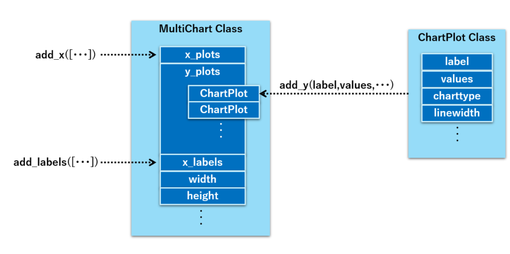
グラフとして描画する情報は、MultiChartクラスの y_plots プロパティに、ChartPlotクラスのインスタンスリストとして保持しています。
そして、ChartPlotクラスのインスタンスは、add_y() で指定したグラフ描画情報(ラベル、データ、グラフの種類など)を保持しています。
以下は MultiChart クラスのソースコードです。
import matplotlib.pyplot as plt
from matplotlib import rcParams
import matplotlib.dates as mdates
import numpy as np
import datetime

class ChartPlot:
    '''
    グラフの種類、プロットデータ等を保存するクラス
    '''

    def __init__(self,label,values,charttype='plot',
                    linewidth=2,linestyle=None,color=None,
                    markersize=0,marker='o',markerfacecolor=None,axis='left',
                    alpha=1.0,fill=False,bins=10):

        '''
        コンストラクタ

        Parameters
        ----------
        labels:str         ラベル
        values:[int],[float]   Y軸にプロットする値のリスト (例:[1,2,3,4,5])
        charttype:str          チャートタイプ 'plot' 又は 'bar'を指定可能
        linewidth:int          折れ線の太さ
        linestyle:str          折れ線の種類  (例:'-','--')
        color:str              折れ線の色
        markersize:int         マーカーサイズ
        marker:str             マーカーの形状
        markerfacecolor:str    マーカーの色(例:'red','b')
        axis:str               Y軸の指定  'left' は左軸、'right' は右軸を使用
        alpha:sfloat           透明度
        fill:bool               折れ線の塗りつぶし
        bins:int                ヒストグラムの階級数
        '''
        self.label = label
        self.values = values
        self.charttype = charttype
        self.linewidth = linewidth
        self.linestyle = linestyle
        self.color = color
        self.marker = marker
        self.markersize = markersize
        self.markerfacecolor = markerfacecolor
        self.axis = axis
        self.alpha = alpha
        self.fill = fill
        self.bins = bins

class MultiChart:
    '''
    複合グラフを簡単に作成するへルーパークラス
    '''

    def __init__ (self,title='',width=None,height=None,facecolor=None,
                  backcolor=None,linewidth=3,edgecolor=None,islegend=True,position='upper right',font='Meiryo',fontsize=10,fig=None):
        '''
        コンストラクタ

        Parameters
        ----------
        title:str      タイトル
        width:int      ウィンド横サイズ(インチ単位)
        height:int     ウィンド縦サイズ(インチ単位)
        facecolor:str  ウインドウの背景色
        edgewidth:int  グラフ外形枠の太さ
        edgecolor:str  グラフ外形枠の色
        backcolor:str  グラフ背景色
        islegend:bool  凡例の表示/非表示設定
        fig:figure     描画対象のfigure
        '''
        self.fig = fig
        self.title = title
        self.width = width
        self.height = height
        self.facecolor = facecolor
        self.backcolor = backcolor
        self.edgewidth = linewidth
        self.edgecolor = edgecolor
        self.islegend = islegend
        self.position = position
        self.groupwidth = 1
        self.barwidth=0.9
        self.font = font
        self.fontsize = fontsize
        self.margine_left=None
        self.margine_right=None
        self.margine_top=None
        self.margine_bottom=None
        self.wspace=None
        self.hspace=None

        self.clear()

    def clear(self):
        '''
        グラフのクリア

        Parameters
        ----------
        なし
        '''
        self.axis_y1 = None
        self.axis_y2 = None
        self.x_labels = []
        self.x_plots = []
        self.y_plots = []
        self.islegend = True
        self.v_lines = []
        self.h_lines = []
        self.x_title = ''
        self.axis_y1_title = ''
        self.axis_y2_title = ''
        self.scatter_default_size = 8
        self.formatter= {'rotation':0,'step':1,'formatter':''}

    def chart_title(self,title):
        '''
        グラフタイトルを設定

        Parameters
        ----------
        title:str    のタイトル
        '''
        self.title = title

    def axis_title(self,x_title,y1_title,y2_title = ''):
        '''
        X軸、Y軸のタイトルを設定

        Parameters
        ----------
        x_title:str    X軸のタイトル
        y1_title:str    Y軸のタイトル
        y2_title:str    Y軸のタイトル
        '''
        self.x_title = x_title
        self.axis_y1_title = y1_title
        self.axis_y2_title = y2_title

    def set_margine(self,wspace=None,hspace=None,left=None,right=None,top=None,bottom=None):
        '''
        グラフの上下左右のマージン設定

        Parameters
        ----------
        wspace:float    横方向のマージン
        hspace:float    縦方向のマージン
        left:float      左マージン
        right:float     左マージン
        top:float       上マージン
        bototm:float    下マージン
        '''
        self.margine_left = left
        self.margine_right = right
        self.margine_top = top
        self.margine_bottom = bottom
        self.wspace = wspace
        self.hspace = hspace

    def axis_formatter(self,step,rotation=0,formatter=''):
        '''
        X軸の値を設定

        Parameters
        ----------
        rotation:int   X軸の角度
        step:int        X軸の間隔
        formatter: str  X軸のフォーマット(X軸データが日付の時)
        '''
        self.formatter = {'rotation':rotation,'step':step,'formatter':formatter}

    def add_labels(self,labels):
        '''
        X軸の値の代わりに表示するラベルを設定

        Parameters
        ----------
        labels:list    ラベルのリスト
        '''
        self.x_labels = labels

    def add_x(self,vals):
        '''
        X軸の値を設定

        Parameters
        ----------
        vals:list    X軸の値のリスト
        '''
        self.x_plots = vals

    def add_y(self,label,vals,chart_type='plot',
                  linewidth=2,linestyle=None,color=None,
                  markersize=0,marker='o',markerfacecolor=None,axis='left',alpha=1.0,fill=False):
        '''
        y軸の値を設定

        Parameters
        ----------
        label:str         ラベル
        values:[int],[float]   Y軸にプロットする値のリスト (例:[1,2,3,4,5])
        charttype:str          チャートタイプ 'plot' 又は 'bar'を指定可能
        linewidth:int          折れ線の太さ
        linestyle:str          折れ線の種類  (例:'-','--')
        color:str              折れ線の色
        markersize:int         マーカーサイズ
        marker:str             マーカーの形状
        markerfacecolor:str    マーカーの色(例:'red','b')
        axis:str               Y軸の指定  'left' は左軸、'right' は右軸を使用
        alpha:sfloat           透明度
        fill:bool             折れ線の塗りつぶし
        '''
        self.y_plots.append(ChartPlot(label,vals,chart_type,linewidth,linestyle,color,
                              markersize,marker,markerfacecolor,axis,alpha,fill))

    def vline(self,x,width=2,linestyle='-',color=None):
        '''
        垂直線の描画

        Parameters
        ----------
        x:int,float          X軸の値
        linewidth:int          線の太さ
        linestyle:str          線の種類  (例:'-','--')
        color:str              線の色
        '''
        self.v_lines.append({'x':x,'width':width,'linestyle':linestyle,'color':color})


    def hline(self,y,width=2,linestyle='-',color=None):
        '''
        水平線の描画

        Parameters
        ----------
        y:int,float          y軸の値
        linewidth:int          線の太さ
        linestyle:str          線の種類  (例:'-','--')
        color:str              線の色
        '''
        self.h_lines.append({'y':y,'width':width,'linestyle':linestyle,'color':color})

    def show(self):
        '''
        グラフの表示
        '''
        plt.show()

    def draw(self,row=1,column=1,position=1,islegend=None,fig = None):
        '''
        グラフの表示

        Parameters
        ----------
        row:int       行の数
        column:int    列の数。
        position:int  表示位置。
        islegend:int  凡例の表示。
        fig:          fig の指定。
        '''
        self.islegend = self.islegend if islegend is None else islegend
        self.__design(row,column,position,fig)
        self.__draw()
        return fig

    def save(self,filename,islegend=None):
        '''
        グラフのファイル保存

        Parameters
        ----------
        filename:str    グラフを保存するファイル名。拡張子によってグラフのフォーマットを指定。
        islegend:int    凡例の表示。
        '''
        self.fig.savefig(filename)

    def __draw(self):
        '''
        グラフの描画処理
        '''
        #X軸の値が指定されていない場合、初期値として連番を設定
        if self.x_plots == [] :
            self.x_plots = [i for i in range(len(self.y_plots[0].values))]
        bottom = []

        #グラフの種類によって描画メソッドを切り替え
        for num,y in enumerate(self.y_plots):

            #軸の決定
            axis = self.axis_y2 if y.axis == 'right' and self.axis_y2 != None else self.axis_y1

            # == 折れ線グラフ処理 ==
            if y.charttype == 'line':
                #折れ線グラフの描画
                #折れ線グラフの描画
                if y.fill:
                    axis.fill_between(self.x_plots,y.values,label=y.label,
                                      lw=y.linewidth,color=y.color,alpha=y.alpha
                        )
                else:
                    axis.plot(self.x_plots,y.values,label=y.label,
                            lw=y.linewidth,ls=y.linestyle,c=y.color,
                            marker=y.marker,markersize=y.markersize,
                            markerfacecolor=y.markerfacecolor,alpha=y.alpha
                        )

             # == 積み上げ縦棒グラフ ==
            elif y.charttype == 'stacked':
                # 積み上げグラフを作成する際のbootom値の初期化
                if bottom == []:
                    bottom = [0 for i in range(len(y.values))]

                # 棒グラフの描画
                axis.bar(self.x_plots,y.values,color=y.color,
                            tick_label = self.x_labels if self.x_labels != [] else None,
                            bottom = bottom,label=y.label,alpha=y.alpha)

                #積み上げグラフのbottom値の更新
                bottom = [bottom[i] + y.values[i] for i in range(len(y.values))]

             # == グルーピング縦棒グラフ ==
            elif y.charttype == 'bar':
                if self.x_plots != [] and (isinstance(self.x_plots[0],datetime.datetime) or isinstance(self.x_plots[0],datetime.date)):
                    x = mdates.date2num(self.x_plots)
                else :
                    x = [i + 1 for i in range(len(self.x_plots))]

                barcnt = len(self.y_plots)
                size = self.groupwidth / barcnt
                xx = self.groupwidth / 2

                # 棒グラフの描画
                pos = [size / 2 + x[n] - xx - size * num for n in range(len(x))]
                axis.bar(pos, y.values, width=size * self.barwidth, label=y.label, align="center",alpha=y.alpha)

            # == 横棒グラフ ==
            elif y.charttype == 'barh':
                axis.barh(self.x_plots, y.values, label=y.label, color=y.color, alpha=y.alpha,
                          tick_label = self.x_labels if self.x_labels != [] else None)

            # == 積み上げ横棒グラフ ==
            elif y.charttype == 'stackedh':
                if bottom == []:
                    bottom = [0 for _ in range(len(y.values))]
                axis.barh(self.x_plots, y.values, left=bottom, label=y.label, color=y.color, alpha=y.alpha)
                bottom = [bottom[i] + y.values[i] for i in range(len(y.values))]

            # == 散布図 ==
            elif y.charttype == 'scatter':
                markersize = y.markersize if y.markersize > 0 else self.scatter_default_size
                axis.scatter(self.x_plots, y.values, label=y.label,
                             c=y.color, marker=y.marker, s=markersize, alpha=y.alpha)

            # == 箱ひげ図 ==
            elif y.charttype == 'box':
                axis.boxplot(y.values, positions=[num], patch_artist=True, boxprops=dict(facecolor=y.color, alpha=y.alpha))

            elif y.charttype == 'hist':
                axis.hist(y.values,alpha=y.alpha, color=y.color,bins=y.bins)

            elif y.charttype == 'pie':
                # 円グラフの描画
                axis.pie(y.values, labels=self.x_labels, autopct='%1.1f%%', startangle=90)

            elif y.charttype == 'radar':
                # レーダーチャートの描画
                angles = np.linspace(0, 2*np.pi, len(y.values) + 1)
                values = y.values
                values.append(values[0])
                axis.plot(angles, y.values)
                axis.fill(angles, values, alpha=y.alpha)
                axis.set_thetagrids(np.degrees(angles[:-1]), self.x_labels)
                axis.set_theta_zero_location("N")
                axis.set_theta_direction(-1)

        #凡例の表示
        if self.islegend:
            #1軸の凡例表示
            if self.axis_y2 == None:
                self.axis_y1.legend(loc=self.position, borderaxespad=1)
            #2軸の凡例表示(1軸と2軸の凡例を合算)
            else:
                handler1, label1 = self.axis_y1.get_legend_handles_labels()
                handler2, label2 = self.axis_y2.get_legend_handles_labels()
                self.axis_y1.legend(handler1 + handler2, label1 + label2, loc=self.position, borderaxespad=1)

        # レイアウトの体裁を整える
        self.fig.tight_layout()


    def __design(self,row=1,column=1,position=1,fig = None):
        '''
        グラフのデザイン(体裁)を設定
        '''
        #漢字対応フォントの設定
        rcParams['font.family'] = self.font
        rcParams['font.size'] = self.fontsize

        # 引数に fig が指定されていると、それを使用
        if fig != None:
            self.fig = fig

        #figure の生成
        if self.fig == None:
            figsize = None if self.width == None or self.height == None else (self.width,self.height)
            self.fig = plt.figure(figsize=figsize,facecolor=self.facecolor,
                                linewidth=self.edgewidth,edgecolor=self.edgecolor)

        # 表示エリアの指定
        polar =  len([x for x in self.y_plots if x.charttype == 'radar']) > 0
        axes = self.fig.add_subplot(row,column,position,polar=polar)

        #グラフ表示領域の上下左右マージン設定
        self.fig.subplots_adjust(left=self.margine_left,right=self.margine_right,
                                     top=self.margine_top,bottom=self.margine_bottom,
                                     wspace=self.wspace,hspace=self.hspace)

        #1軸のsubplotと軸タイトルを設定
        self.axis_y1 = axes
        self.axis_y1.set_title(self.title)
        self.axis_y1.set_ylabel(self.axis_y1_title)
        self.axis_y1.set_xlabel(self.x_title)

        # x_plots の値が Datetimeなら、X軸を datetime として表示
        if self.x_plots != [] and (isinstance(self.x_plots[0],datetime.datetime) or isinstance(self.x_plots[0],datetime.date)):
            fmt = mdates.DateFormatter(self.formatter['formatter'])
            loc = mdates.DayLocator(interval=self.formatter['step'])
            self.axis_y1.xaxis.set_major_formatter(fmt)
            self.axis_y1.xaxis.set_major_locator(loc)
            delta = (self.x_plots[1] - self.x_plots[0])/2
            self.axis_y1.set_xlim(self.x_plots[0]-delta, self.x_plots[len(self.x_plots)-1]+delta)

        #X軸の角度を設定
        self.axis_y1.tick_params(axis='x',rotation=self.formatter['rotation'])

        #yの2軸目が指定されていたら、1軸と関連付けを行う
        if self.axis_y2_title != '':
            self.axis_y2= self.axis_y1.twinx()
            self.axis_y2.set_ylabel(self.axis_y2_title)

        #グリッド線の描画
        self.axis_y1.grid(True)

        #現在のfigureを取得し、グラフ表示部分の背景色を設定
        if self.backcolor != None:
            self.axis_y1.set_facecolor(self.backcolor)

        #垂直線の描画
        if len(self.v_lines) > 0:
            for v_line in self.v_lines:
                self.axis_y1.axvline(v_line['x'],0,1,lw=v_line['width'],
                            ls=v_line['linestyle'],color=v_line['color'])

        #水平線の描画
        if len(self.h_lines) > 0:
            for h_line in self.h_lines:
                self.axis_y1.axhline(h_line['y'],0,1,lw=h_line['width'],
                            ls=h_line['linestyle'],color=h_line['color'])
まとめ
この記事では、Matplotlibの機能を拡張したMultiChartクラスを紹介しました。MultiChartクラスを使うことで、より簡単に、そして視覚的に美しいグラフを作成することができます。手軽にデータの可視化を行いたい方は、ぜひこのクラスを活用してみてください。
本記事では、以下の内容について、サンプルプログラム付きで解説しました。
- MultiChartクラスの概要と特徴
- MultiChartクラスの使い方(具体的なコード例)
- MultiChartクラスのソースコード(詳細)
- 各メソッドの詳細な説明
MultiChartは私が現時点で必要としている機能だけを実装しており、目的によっては不足している機能があると思います。その際は、必要に応じてカスタマイズの上、ご活用頂ければ幸いです。


コメント